Production Log.
Cover 1

I immediately knew which direction I wanted my summer edition cover image to go in, vibrant pinks and blues were a definite. I wanted to have a gradient masthead and then brighten my main image to fit the lively aesthetic. By including coverlines that were obviously about the female in the image, I included anchorage and interest o=to my cover with catchy phrases and placements that stood out on the page.
Cover 2
Originally, this was my cover image and after I had added the main image and produced some coverlines, I wanted to fill up the space with images and colours that contrasted with the main image's vibrancy and add in new shapes for dimension. Since this is the autumn edition, I decided to use the orange photography I got and that fitted well with the difference in colours I planned on using in my other cover. I added gradients and more text to make the cover more lively and
exciting to look at, I played around with colours and mixing fonts as well as adding a Puff and coverlines.
Still not my final result but the contrast of vibrant colours and gradients fits well with the theme and ideas of the magazine and the young audience that its directed towards. I had decided to change the background colours of each to black instead of white because I thought it made the colours stand out more and look professional and I also changed the image to a more conventional magazine image of my friend Yash.
After inverting the colours on cover 2, I also decided to change the font of the slogans of each magazine as i was unimpressed with how the fonts all over the same looked identical with no depth.
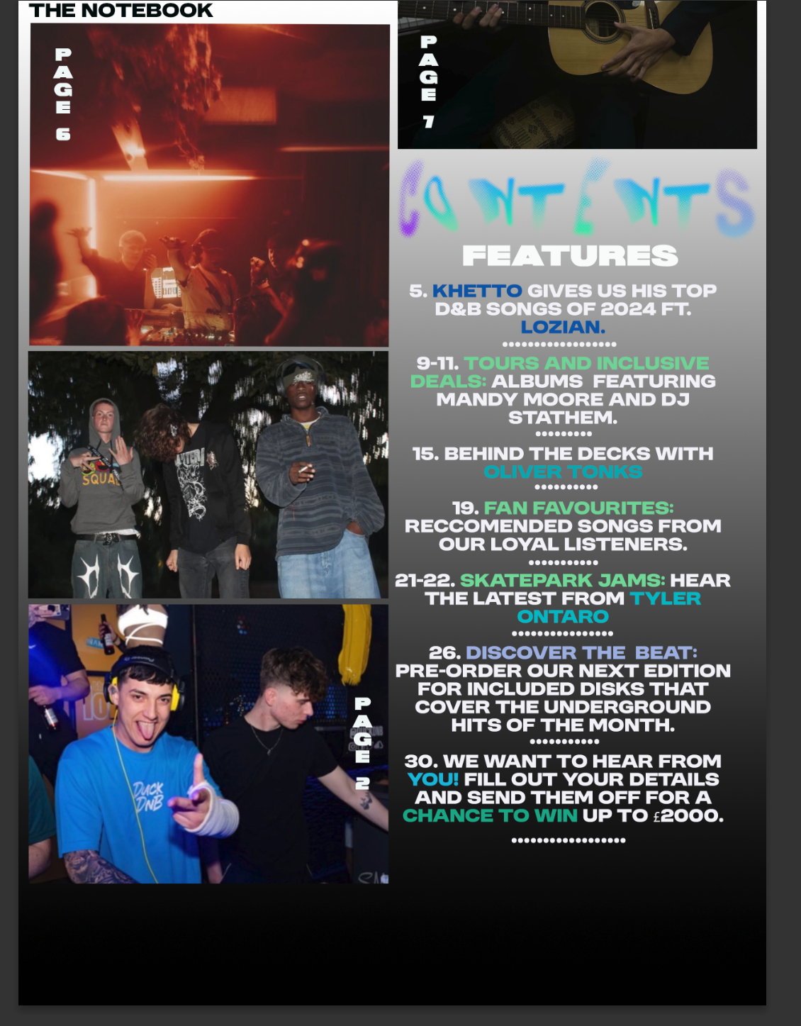
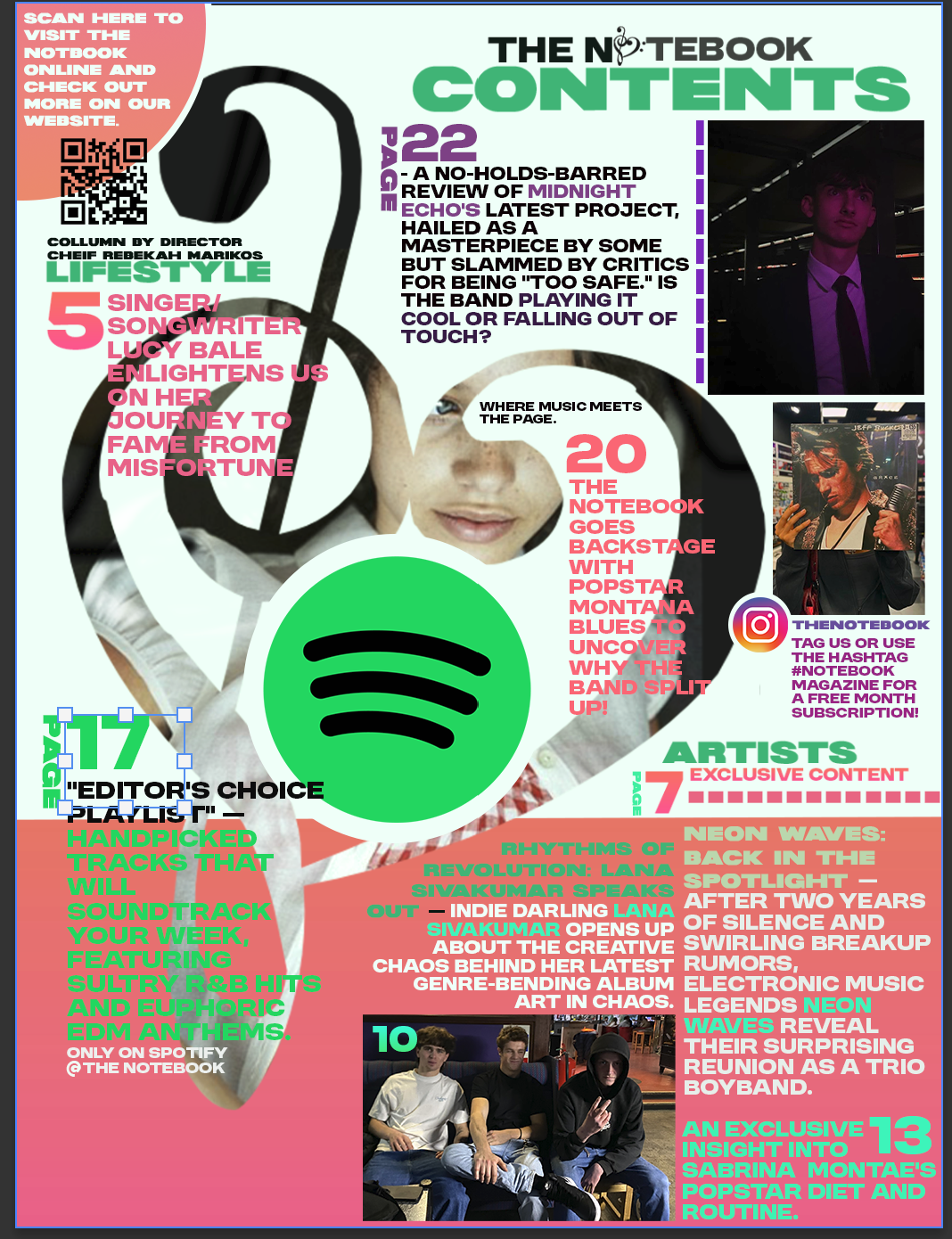
CONTENTS PAGES PRODUCTION LOG:
more practice and playing around:

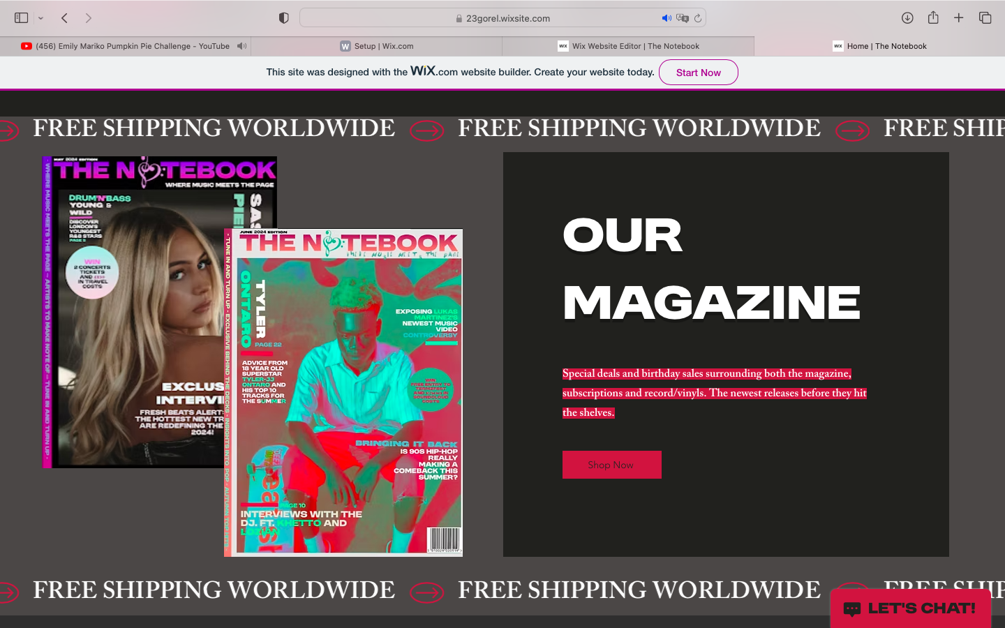
WEBSITE PRODUCTION:
I wanted to include interactive elements, although they don't actually lead off onto anything, as my only linked page is from the Explore tab, and I wanted them to seem as though they branch off onto interesting music-related contents and information.
By linking my magazine covers, I am using digital media convergence and creating that sense of brand identity, alongside the matching fonts and colour scheme.
Here, I composed and edited a series of clips of my friend Luke to create a short youtube-style reel that captures the young vibe of the magazine and adds a fun aspect to the website. By linking the fictional "Sam Finn" and "Midnight Echo" to my contents pages 1 an 2, this added anchorage and a general sense of brand identity with the logo and name included on the video.
MY LINKED PAGE- my linked page can be accessed through the banner that reads EXPLORE and leads to a series of music video links [videos cant be accessed but the covers are the main focus] that I edited on Wix.
Here I just included a fake 'team' although I did include myself, pretending that I had a team of help when it was just myself.
More contents page ideas (as I had too many to choose from):
This was originally my contents page design but the title position didn't match my favourite one that I had created so I had to redesign and move it around.
ALMOST final cover and contents products - with edits completed:
After close consideration, i realised that this didnt match the colour scheme of cover 1's first edition so I recreated it and used more female-catered information to appeal to the covers demographic audience.
As well as making the background black like the covers.
FINAL EDITS